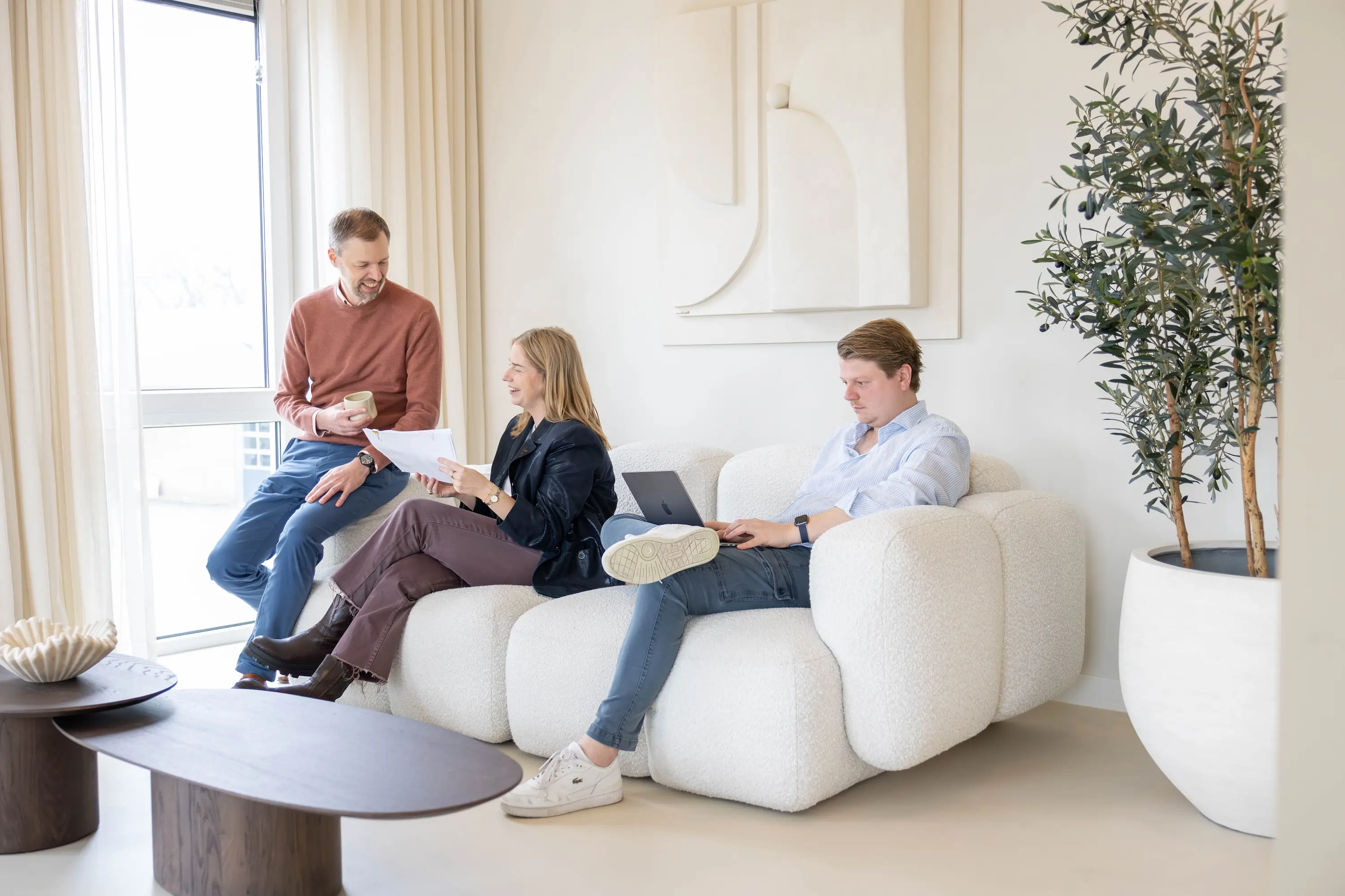
Designer’s Choice: how color and balance brought the Sigmax design to life
A strong office design starts with a solid foundation. But it’s only when all elements come together that a space truly works. That’s when it gains atmosphere. At Sigmax, the foundation was already in place. The layout was well thought out, with clear zones and a logical flow that supported daily use. Functionally, the design worked. Still, something felt off. It lacked cohesion. Our designer Roza — with nearly 10 years of experience and a sharp eye for balance — immediately saw the issue. It wasn’t the layout. It was the color choices.

Roza has been working as an interior designer for around a decade, moving seamlessly between intake, layout, and material selection. What defines her work? A strong sense of balance. She looks for the moment when everything aligns — where a design not only works functionally, but also feels right visually and emotionally. Her style is clean and cohesive, with a strong focus on spatial flow.
“Only when layout, color, and functionality come together does a design truly feel right. You notice it instantly.”
From color to calm and cohesion
The original plan leaned heavily on the Sigmax brand colors — terra orange and red. Combined with red office chairs, it created a space that felt constantly ‘on’. Too intense for an environment where focus is key. Functionally, the design worked. Visually, it didn’t.
When Roza stepped in, she shifted direction. By introducing purple and blue tones, balance was restored. The aubergine purple added warmth without overpowering, while blue tones subtly blended into green. This created a stronger connection with the building’s surroundings — with its abundance of glass, plants, and moss elements bringing the outside in. From that point on, the design truly came to life.
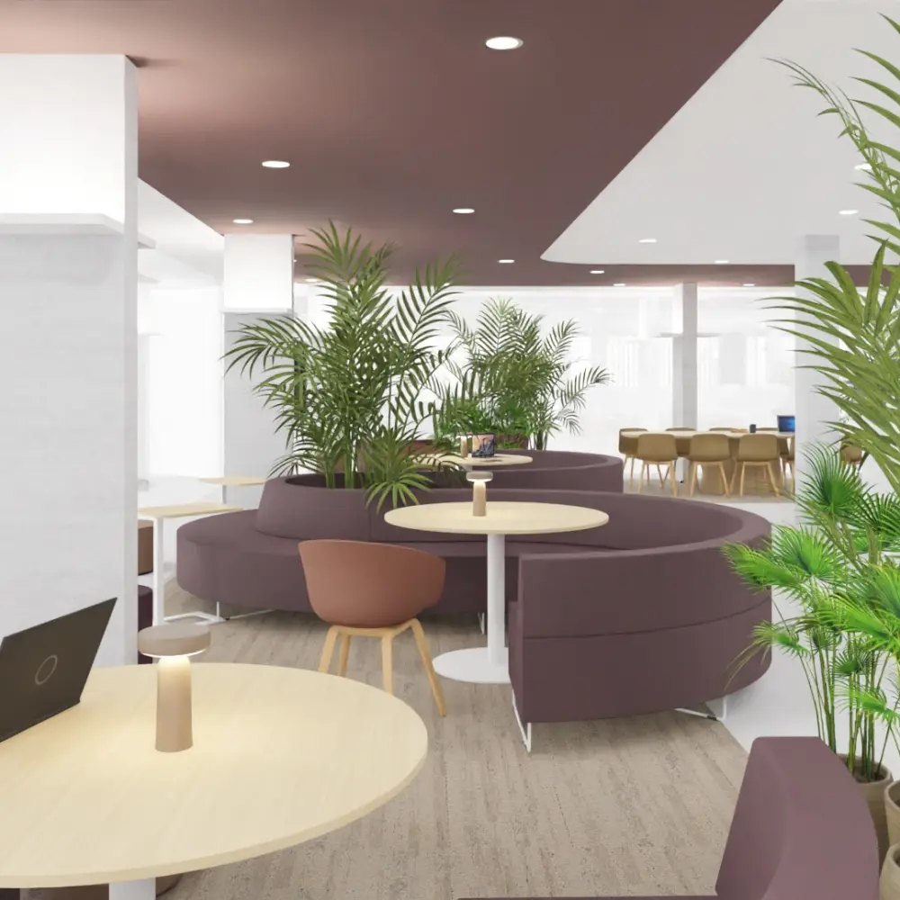
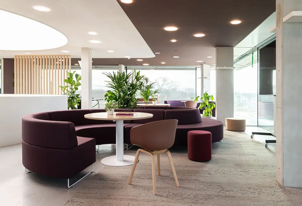
Balance in the bigger picture
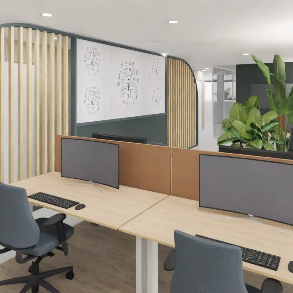
The strength of the design lies not just in color, but in how everything comes together. This is especially visible on the top floor. This space acts as the social heart of the office and demonstrates an important principle: large spaces require bold decisions. In a large building, subtlety doesn’t cut it — you need strong, intentional gestures. Not scattered elements, but one cohesive whole that immediately feels right. A great example is the custom-made furniture piece (designed by colleague Laury). It functions as a partition wall while integrating a whiteboard — a solution that adds functionality without visual clutter.
Refining is key
This Sigmax project clearly shows where the strength of a good designer lies. It’s not about clinging to the first idea, but about refining it. By listening, filtering, and sometimes removing elements, a space emerges that not only looks good on paper, but actually works in practice. That’s where a truly effective office begins.
Is your office more of a color clash than a calm, balanced workspace? Plan a design intake and discover what’s possible for your office interior.